Tips XAML
- レイアウト
<Grid.ColumnDefinitions>
<ColumnDefinition Width="320"></ColumnDefinition>
</Grid.ColumnDefinitions>
<Grid.RowDefinitions>
<RowDefinition Height="40"></RowDefinition>
<RowDefinition Height="120"></RowDefinition>
<RowDefinition Height="80"></RowDefinition>
</Grid.RowDefinitions>
- TextBlock
<TextBlock Grid.Row="2" TextWrapping="Wrap" FontSize="14" Background="MintCream">
Linux-Apacheの...<LineBreak/>「butunn1」...
</TextBlock>
- StackPanel、DockPanel
Canvas は、コントロールの位置指定が必要だが、StackPanel、DockPanelは、Orinetationで指定した方向に順次配置する。
- StackPanel と DockPanel の差異
よく分からない。
- プロジェクトの追加で、Silverlightアプリケーションで、「Silverlightをホストするための新しいASP.NET Web プロジェクトを追加する」を選ぶと「プロジェクト名」と「プロジェクト名.Web」の2つのプロジェクトができる。
- このとき、「ソリュ-ションエクスプローラ」でサブフォルダを作り、「Silverlightユーザコントロール」を追加したら、表示されない。コンパイルなどではエラーにならない。
- XAMLに書かれたイベントハンドラが、ビハンドコードにあるかどうかは使われるまでチェックされない。 チャックされることもある。
- 「Silverlightユーザコントロール」を追加したら、引用する側では
<UserControl x:Class="sla1.Page"
xmlns="http://schemas.microsoft.com/winfx/2006/xaml/presentation"
xmlns:x="http://schemas.microsoft.com/winfx/2006/xaml"
xmlns:uc="clr-namespace:SilverlightLibrary"
Width="360" Height="360">
の、ように名前空間を設定し、
<uc:SimpleSlider Text="外側の円の回転" ... />
の、ように使う。
- 「Silverlightクラスライブラリ」を作って,「Silverlightユーザコントロール」を入れた場合(「Silverlightユーザコントロール」をDLLにした場合)は、ツールボックスの下の余白で、右ボタンメニューから「アイテムの選択」で、「Silverlightコンポーネント」としてDLLを追加する。
- Silverlightでは、TextBlockにbackgroundが記述できなかった。StackPlainの中に入れて、StackPlainにbackgroundを記述した。
- 枠を描くには、
<Border BorderBrush="Blue" BorderThickness="1"> ... </Border>
- 「新しいプロジェクト」で自動的に作られる .xaml について
.xaml.cs と対で作られる。
アプリケーション・クラスとスタート・クラスを定義する。
app.xaml の Application タグのStartupUriでwindow1.xaml、page1.xamlの使用が定義される。ただし、Silverlightの場合は別で、良く分からない。
- .xaml と .xaml.cs の対で作られるが、.cs が不要なら、.xaml のApplicationやWindowなどのタグから、x:Class= ... を削除すれば、.cs は参照されない。
- XY平面を数学のように。Y軸を反転。原点を中央に。
- <Window x:Class="wpf_color_map1.Window1"
- xmlns="http://schemas.microsoft.com/winfx/2006/xaml/presentation"
- xmlns:x="http://schemas.microsoft.com/winfx/2006/xaml"
- Title="Hue" Height="300" Width="300">
- <Grid>
- <Canvas x:Name="canvas1" Loaded="canvas1_Loaded">
- <Canvas.RenderTransform>
- <MatrixTransform>
- <MatrixTransform.Matrix>
- <Matrix M11="1" M12="0" M21="0" M22="-1" OffsetX="150" OffsetY="150"></Matrix>
- </MatrixTransform.Matrix>
- </MatrixTransform>
- </Canvas.RenderTransform>
- <Line X1="-100" Y1="0" X2="100" Y2="0" Stroke="Green" StrokeThickness="1"/>
- <Line X1="0" Y1="-100" X2="0" Y2="100" Stroke="Green" StrokeThickness="1"/>
- </Canvas>
- </Grid>
- </Window>
- Blenderからジオメトリを取り込む
プラグイン(xaml_export.py)を使って、BlenderからXAML形式でエクスポートする。
この出力ファイルを編集して使う。
<GeometryModel3D> エレメント1つを残して、それ以外を削除する。
これを <ResourceDictionary> の要素にする。
- <ResourceDictionary
- xmlns="http://schemas.microsoft.com/winfx/2006/xaml/presentation"
- xmlns:x="http://schemas.microsoft.com/winfx/2006/xaml" >
- <MeshGeometry3D x:Key="_sphere"
- Positions="-0.000001 -0.000001 -1.0 0.096133 0.019122 ..."
- />
- </ResourceDictionary>
使い方は、次の例参照。
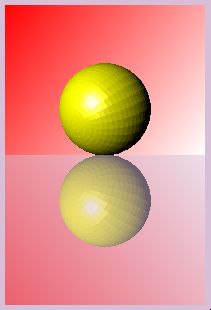
- スペキュラ、発光
 Blenderで、球を描いて、XAMLでエクスポートし、ジオメトリだけを流用した。 Blenderで、球を描いて、XAMLでエクスポートし、ジオメトリだけを流用した。
表面を塗るブラシの他に <EmissiveMaterial>、<SpecularMaterial> で、それぞれブラシを指定する。このとき指定する色は、色ではなく、表面を塗るブラシの色に対して演算(加算)する値だろうと思う。
<SpecularMaterial> には、SpecularPower があり、ハイライト領域の先鋭さを制御できる。
http://hp.vector.co.jp/authors/VA039696/xaml/sphere/iframe_sphere2.xaml
(軸はビハインドコードで描いているので、XAMLだけのサンプルでは表示されない。)
- <Page ShowsNavigationUI="False"
- xmlns="http://schemas.microsoft.com/winfx/2006/xaml/presentation"
- xmlns:x="http://schemas.microsoft.com/winfx/2006/xaml">
- <!--リソース-->
- <Page.Resources>
- <ResourceDictionary>
- <ResourceDictionary.MergedDictionaries>
- <!--ジオメトリを別のXAMLファイルから読み込む-->
- <ResourceDictionary Source="sphere.xaml"/>
- </ResourceDictionary.MergedDictionaries>
- </ResourceDictionary>
- </Page.Resources>
- <Grid>
- <Grid.RowDefinitions>
- <RowDefinition/>
- <RowDefinition Height="54"/>
- </Grid.RowDefinitions>
- <Viewport3D x:Name="viewport1" Grid.Row="0">
- <Viewport3D.Camera>
- <!--カメラ-->
- <PerspectiveCamera
- LookDirection="-1, -1, -1" Position="2,2,2" FieldOfView="45">
- </PerspectiveCamera>
- </Viewport3D.Camera>
- <ModelVisual3D>
- <ModelVisual3D.Content>
- <!--ライト-->
- <DirectionalLight Color="White" Direction="1,-1,-1" />
- </ModelVisual3D.Content>
- </ModelVisual3D>
- <ModelVisual3D>
- <ModelVisual3D.Content>
- <!--リソースで定義したジオメトリを使用-->
- <GeometryModel3D Geometry="{StaticResource _sphere}">
- <GeometryModel3D.Material>
- <MaterialGroup>
- <!--物体の色-->
- <DiffuseMaterial Brush="Yellow"/>
- <!--物体の発光-->
- <EmissiveMaterial Brush="Gray"/>
- <!--ハイライト-->
- <SpecularMaterial Brush="White" SpecularPower="{Binding ElementName=slider1, Path=Value}"/>
- </MaterialGroup>
- </GeometryModel3D.Material>
- </GeometryModel3D>
- </ModelVisual3D.Content>
- </ModelVisual3D>
- </Viewport3D>
- <Grid Grid.Row="1">
- <StackPanel>
- <StackPanel Orientation="Horizontal">
- <TextBlock Text="SpecularPower :"/>
- <TextBlock Text="{Binding ElementName=slider1, Path=Value}"/>
- </StackPanel>
- <Slider Name="slider1" Minimum="2" Maximum="100" Value="10" Ticks="0.1"/>
- </StackPanel>
- </Grid>
- </Grid>
- </Page>
- XAMLを直接ブラウザ(IE)で開く
<Window>ではなく、<Page>にする。
x:Class=... は、削除。
x:Name="..." の箇所は、単にName="..."として良いよう。
- 3Dの物体がテーブルに写る
- <Page
- xmlns="http://schemas.microsoft.com/winfx/2006/xaml/presentation"
- xmlns:x="http://schemas.microsoft.com/winfx/2006/xaml"
- Background="Thistle">
- <!--リソース-->
- <Page.Resources>
- <ResourceDictionary>
- <ResourceDictionary.MergedDictionaries>
- <!--ジオメトリを別のXAMLファイルから読み込む-->
- <ResourceDictionary Source="sphere.xaml"/>
- </ResourceDictionary.MergedDictionaries>
- </ResourceDictionary>
- </Page.Resources>
- <!--表示領域-->
- <StackPanel Margin="20">
- <!--上段画像-->
- <Border Name="original1" Width="200" Height="150">
- <Border.Background>
- <LinearGradientBrush StartPoint="0,0" EndPoint="1,1">
- <GradientStop Offset="0.0" Color="Red" />
- <GradientStop Offset="1.0" Color="White" />
- </LinearGradientBrush>
- </Border.Background>
- <Viewport3D>
- <!--カメラ-->
- <Viewport3D.Camera>
- <PerspectiveCamera Position="3 2 4" LookDirection="-3 -1.35 -4"/>
- </Viewport3D.Camera>
- <!--照明-->
- <ModelVisual3D>
- <ModelVisual3D.Content>
- <DirectionalLight Direction="0 -5 -8"/>
- </ModelVisual3D.Content>
- </ModelVisual3D>
- <!--図形 球-->
- <ModelVisual3D>
- <ModelVisual3D.Content>
- <!--リソースで定義したジオメトリを使用-->
- <GeometryModel3D Geometry="{StaticResource _sphere}">
- <GeometryModel3D.Material>
- <MaterialGroup>
- <!--物体の色-->
- <DiffuseMaterial Brush="Yellow"/>
- <!--ハイライト-->
- <SpecularMaterial Brush="White" SpecularPower="50"/>
- </MaterialGroup>
- </GeometryModel3D.Material>
- </GeometryModel3D>
- </ModelVisual3D.Content>
- </ModelVisual3D>
- </Viewport3D>
- </Border>
- <!--下段画像-->
- <Rectangle Width="{Binding Path=ActualWidth, ElementName=original1}"
- Height="{Binding Path=ActualHeight, ElementName=original1}">
- <Rectangle.Fill>
- <VisualBrush Opacity="0.5" Visual="{Binding ElementName=original1}">
- <VisualBrush.RelativeTransform>
- <MatrixTransform Matrix="1,0, 0,-1, 0,1">
- </MatrixTransform>
- </VisualBrush.RelativeTransform>
- </VisualBrush>
- </Rectangle.Fill>
- </Rectangle>
- </StackPanel>
- </Page>
- スタイル
- <Page
- xmlns="http://schemas.microsoft.com/winfx/2006/xaml/presentation"
- xmlns:x="http://schemas.microsoft.com/winfx/2006/xaml"
- Title="Page1">
- <Page.Resources>
- <!--スタイルがしてされていないTextBlockに作用する-->
- <Style TargetType="TextBlock">
- <Setter Property="Background" Value="Green"/>
- <Setter Property="Foreground" Value="Yellow"/>
- </Style>
- <!--スタイルをキーで指定する場合-->
- <Style x:Key="BG_RED" TargetType="TextBlock">
- <Setter Property="Background" Value="OrangeRed"/>
- </Style>
- <!--スタイルのベースを継承して設定-->
- <Style x:Key="BASED_ON" BasedOn="{StaticResource {x:Type TextBlock}}" TargetType="TextBlock">
- <Setter Property="Background" Value="OrangeRed"/>
- </Style>
- </Page.Resources>
- <Grid>
- <StackPanel>
- <TextBlock>
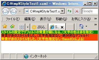
- スタイルの設定でデフォルトの背景が緑になる。(文字の色は赤を指定)
- </TextBlock>
- <TextBlock Style="{StaticResource BG_RED}">
- 背景が赤のスタイルをした。(文字色指定なし-絶対的なデフォルト)
- </TextBlock>
- <TextBlock Style="{StaticResource BASED_ON}">
- 背景が赤のスタイルをした。(文字色指定なし-BasedOnによる)
- </TextBlock>
- </StackPanel>
- </Grid>
- </Page>
- <Page.Resources>内に、x:Key="キー" で割り当てたオブジェクトにアクセスする。
<XmlDataProvider x:Key="xmlDataProvider1" ...
ビハインドコードで以下のように参照する。
XmlDataProvider xdp = (XmlDataProvider)this.Resources.FindName("xmlDataProvider1");
※Resources["xmlDataProvider1"]で良い。(FindName()がない。)
- XAML中にURLを記述する場合、パラメータの分離用の & は、& にエスケープする必要がある。(C#では不要)
- TextBoxで入力した文字列をURLのパラメータに使うには、ビハインドコードで、
System.Web.HttpUtility.UrlEncode()
を、使う。
- XmlDataProviderを使う場合、リソースにする以外に、<Grid>の中に書くこともできる。
ルートの<Grid>に続いて、
- <Grid x:Name="grid1" Margin="8" Background="Tan">
- <Grid.DataContext>
- <XmlDataProvider x:Name="xmlDataProvider1" .../>
- </Grid.DataContext>
ビハインドコードで、Nameの名前が使える。
- ビハインドコードでバインドする。
- XmlDataProvider xdp = new XmlDataProvider();
- xdp.Source = new Uri("http://www...");
- xdp.XPath = "element/item";
- Binding bind=new Binding();
- bind.Source = xdp;
- grid1.SetBinding(Grid.DataContextProperty,bind);
- DataTemplate
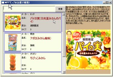
左図の左側は、ListBox。
矩形の1つ1つが商品に対応していて商品の選択に使う。
- <!--ListBox-->
- <ListBox Grid.Row="1" ItemsSource="{Binding}"
- ItemTemplate="{DynamicResource ListItemTemplate}"
- IsSynchronizedWithCurrentItem="True" />
個々の矩形には、写真とメーカー、品名などから構成さる。
この構成を定義しているのが、DataTemplate。 リソースとして定義している。内容には表示のレイアウトとバインディングが設定されている。
- <!--ListBox部分のテンプレート-->
- <Page.Resources>
- <DataTemplate x:Key="ListItemTemplate">
- <Border Margin="2" Height="100"
- BorderBrush="Blue" BorderThickness="1" CornerRadius="3">
- <Grid>
- <Grid.ColumnDefinitions>
- <ColumnDefinition Width="100" />
- <ColumnDefinition Width="50" />
- <ColumnDefinition Width="180" />
- </Grid.ColumnDefinitions>
- <!--写真-->
- <Border Grid.Column="0" Margin="2" Background="LightYellow"
- BorderBrush="Blue" BorderThickness="1" CornerRadius="3">
- <Image Margin="2,2,2,2" Source="{Binding XPath=image}"
- Stretch="Uniform"/>
- </Border>
- <!--項目名-->
- <StackPanel Grid.Column="1">
- <TextBlock Height="20">メーカー:</TextBlock>
- <TextBlock Height="40">品名:</TextBlock>
- <TextBlock Height="20">区分:</TextBlock>
- <TextBlock Height="20">タイプ:</TextBlock>
- </StackPanel>
- <!--項目値-->
- <StackPanel Grid.Column="2">
- <TextBlock Height="20" Text="{Binding XPath=maker}"/>
- <TextBlock Height="40" Text="{Binding XPath=name}"
- TextWrapping="Wrap" FontSize="16"
- Foreground="DarkRed" />
- <TextBlock Height="20" Text="{Binding XPath=tag}"/>
- <TextBlock Height="20" Text="{Binding XPath=type}"/>
- </StackPanel>
- </Grid>
- </Border>
- </DataTemplate>
- </Page.Resources>
- 丸いボタン(ControlTemplate)
 コントロールには、Templete プロパティがある。 コントロールには、Templete プロパティがある。
このプロパティにセットすることで、形状や色を変えられる。
- <Page
- xmlns="http://schemas.microsoft.com/winfx/2006/xaml/presentation"
- xmlns:x="http://schemas.microsoft.com/winfx/2006/xaml">
- <!--リソース-->
- <Page.Resources>
- <ControlTemplate x:Key="EllipseButton" TargetType="Button">
- <Grid>
- <Ellipse Fill="Red"/>
- <Ellipse Margin="8" Fill="Green"/>
- <ContentPresenter HorizontalAlignment="Center"
- VerticalAlignment="Center"/>
- </Grid>
- </ControlTemplate>
- </Page.Resources>
- <StackPanel>
- <Button Width="100" Height="100" Template="{StaticResource EllipseButton}">
- ボタン
- </Button>
- </StackPanel>
- </Page>
変更内容は、ControlTemplate で設定する。
- 丸いボタン(ControlTemplateを別ファイルで)
定義:
- <ResourceDictionary
- xmlns="http://schemas.microsoft.com/winfx/2006/xaml/presentation"
- xmlns:x="http://schemas.microsoft.com/winfx/2006/xaml" >
- <ControlTemplate x:Key="EllipseButton" TargetType="Button">
- <Grid>
- <Ellipse Fill="Red"/>
- <Ellipse Margin="8" Fill="Green"/>
- <ContentPresenter HorizontalAlignment="Center"
- VerticalAlignment="Center"/>
- </Grid>
- </ControlTemplate>
- </ResourceDictionary>
引用:
- <Page
- xmlns="http://schemas.microsoft.com/winfx/2006/xaml/presentation"
- xmlns:x="http://schemas.microsoft.com/winfx/2006/xaml">
- <!--リソース-->
- <Page.Resources>
- <ResourceDictionary>
- <ResourceDictionary.MergedDictionaries>
- <ResourceDictionary Source="button.xaml"/>
- </ResourceDictionary.MergedDictionaries>
- </ResourceDictionary>
- </Page.Resources>
- <StackPanel>
- <Button Width="100" Height="100" Template="{StaticResource EllipseButton}">
- ボタン
- </Button>
- </StackPanel>
- </Page>
- ボタンのアニメーション効果(Silverlight)
- <UserControl x:Class="sla_anim_button1.Page"
- xmlns="http://schemas.microsoft.com/winfx/2006/xaml/presentation"
- xmlns:x="http://schemas.microsoft.com/winfx/2006/xaml"
- Width="400" Height="300">
- <UserControl.Resources>
- <ControlTemplate x:Key="EllipseButton1" TargetType="Button"
- xmlns:vsm="clr-namespace:System.Windows;assembly=System.Windows">
- <Grid>
- <vsm:VisualStateManager.VisualStateGroups>
- <vsm:VisualStateGroup x:Name="CommonStates">
- <vsm:VisualState x:Name="Normal" />
- <vsm:VisualState x:Name="MouseOver">
- <Storyboard>
- <ColorAnimation Storyboard.TargetName="inside1"
- Storyboard.TargetProperty="Color" To="Cyan" />
- </Storyboard>
- </vsm:VisualState>
- <vsm:VisualState x:Name="Pressed">
- <Storyboard >
- <ColorAnimation Storyboard.TargetName="inside1"
- Storyboard.TargetProperty="Color" To="#ff000000"/>
- </Storyboard>
- </vsm:VisualState>
- </vsm:VisualStateGroup>
- </vsm:VisualStateManager.VisualStateGroups>
- <Ellipse Fill="Red"/>
- <Ellipse Margin="8">
- <Ellipse.Fill>
- <SolidColorBrush x:Name="inside1" Color="Green"/>
- </Ellipse.Fill>
- </Ellipse>
- <ContentPresenter HorizontalAlignment="Center"
- VerticalAlignment="Center"/>
- </Grid>
- </ControlTemplate>
- </UserControl.Resources>
- <Grid x:Name="LayoutRoot" Background="White" Loaded="LayoutRoot_Loaded">
- <Button Width="100" Height="100" Template="{StaticResource EllipseButton1}" Content="ボタン"/>
- </Grid>
- </UserControl>
- XamlReader(SilverLight)
- <UserControl x:Class="sla_xamlreader1.Page"
- xmlns="http://schemas.microsoft.com/winfx/2006/xaml/presentation"
- xmlns:x="http://schemas.microsoft.com/winfx/2006/xaml"
- Width="400" Height="300">
- <Grid x:Name="LayoutRoot" Background="White" Loaded="LayoutRoot_Loaded" >
- </Grid>
- </UserControl>
- private void LayoutRoot_Loaded(object sender, RoutedEventArgs e)
- {
- StackPanel sp = (StackPanel)System.Windows.Markup.XamlReader.Load(
- "<StackPanel "
- + "xmlns=\"http://schemas.microsoft.com/winfx/2006/xaml/presentation\" />");
- LayoutRoot.Children.Add(sp);
- for (int i = 0; i < 5; i++)
- {
- string xaml = string.Format("<TextBlock "
- + "xmlns=\"http://schemas.microsoft.com/winfx/2006/xaml/presentation\" "
- +"Text=\"ここは、 {0} 番目\"/>", i);
- TextBlock ctrl = (TextBlock)System.Windows.Markup.XamlReader.Load(xaml);
- sp.Children.Add(ctrl);
- }
- }
- リソース(スタイル)をコードで設定する(Silverlight)
Silverlightでは、ResourceDirectoryにSourceプロパティがなく、XAMLファイルを読み込めない。この代案にXamlReaderを使うことを考える。
1.リソースをコードで追加する方法
2.XAML形式からリソースを追加する方法
3.コードでリソースを参照する方法
4.XAML形式でリソースを参照する方法
- readonly string XMLNS = " xmlns=\"http://schemas.microsoft.com/winfx/2006/xaml/presentation\""
- + " xmlns:x=\"http://schemas.microsoft.com/winfx/2006/xaml\" ";
- private void LayoutRoot_Loaded(object sender, RoutedEventArgs e)
- {
- //コードでリソースを追加する
- Style style1 = new Style(typeof(TextBlock));
- style1.Setters.Add(new Setter(TextBlock.ForegroundProperty, new SolidColorBrush(Colors.Red)));
- App.Current.Resources.Add("style1", style1);
- //XAML形式からリソースを追加する
- Style style2 = (Style)XamlReader.Load(
- "<Style" + XMLNS + "TargetType=\"TextBlock\"> "
- + "<Setter Property=\"Foreground\" Value=\"Red\"/> "
- + "</Style>");
- App.Current.Resources.Add("style2", style2);
- //スタックパネルを追加する
- StackPanel sp = new StackPanel();
- LayoutRoot.Children.Add(sp);
- //コードでリソースを参照する
- TextBlock tb1 = new TextBlock();
- tb1.Style = (Style)App.Current.Resources["style1"];
- tb1.Text = "スタイルの作用で赤い文字になる。";
- sp.Children.Add(tb1);
- //XAML形式でリソースを参照する
- TextBlock tb2 = (TextBlock)XamlReader.Load("<TextBlock" + XMLNS
- + " Style=\"{StaticResource style2}\" "
- + "Text=\"スタイルの作用で赤い文字になる。\" />");
- sp.Children.Add(tb2);
- }
- スタイルを別なファイルからロードする(Silverlight)
Silverlightでは、ResourceDirectoryにSourceプロパティがなく、XAMLファイルを読み込めない。この代案にXamlReaderを使うことを考える。
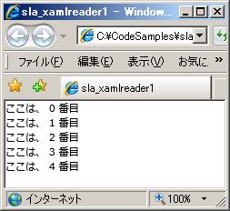
サンプルの実行:sla_xamlreader1
1.アプリケーション(ページ)では、LoadStyles()を呼び出す。
Page.xaml.cs
- using System.Windows;
- using System.Windows.Controls;
- using System.Windows.Markup;
- namespace sla_xamlreader1
- {
- public partial class Page : UserControl
- {
- public Page()
- {
- InitializeComponent();
- }
- readonly string XMLNS = " xmlns=\"http://schemas.microsoft.com/winfx/2006/xaml/presentation\""
- + " xmlns:x=\"http://schemas.microsoft.com/winfx/2006/xaml\" ";
- private void LayoutRoot_Loaded(object sender, RoutedEventArgs e)
- {
- LoadStyles("AppStyles.xml");
- //スタックパネルを追加する
- StackPanel sp = new StackPanel();
- LayoutRoot.Children.Add(sp);
- //コードでリソースを参照する
- TextBlock tb1 = new TextBlock();
- tb1.Style = (Style)App.Current.Resources["style1"];
- tb1.Text = "スタイルの作用で赤い文字になる。";
- sp.Children.Add(tb1);
- //XAML形式でリソースを参照する
- TextBlock tb2 = (TextBlock)XamlReader.Load("<TextBlock" + XMLNS
- + " Style=\"{StaticResource style2}\" "
- + "Text=\"スタイルの作用で緑の文字になる。\" />");
- sp.Children.Add(tb2);
- }
- }
- }
2.LoadStyles()は、指定されたXMLファイルからスタイルを読み込む。
Silverlightの実行形式のxapは、フォルダをZIP圧縮したもの。
ブラウザ側では、これを展開したフォルダがアクセスできる。
(分離ストレージ)
プロジェクトにXMLファイルを含めておけば、一緒にパックされ、
ブラウザ側に送られる。
LoadStyles.cs
- using System.Windows.Controls;
- using System.Xml;
- using System.Windows.Markup;
- namespace sla_xamlreader1
- {
- public partial class Page : UserControl
- {
- /// <summary>
- /// XMLファイルに書かれたスタイルをApp.Current.Resourcesに追加します。
- /// </summary>
- /// <param name="fn">スタイルを記述したXMLファイルの名前</param>
- void LoadStyles(string fn)
- {
- using (XmlReader reader = XmlReader.Create(fn))
- {
- reader.MoveToContent();
- while (reader.ReadToFollowing("Style"))
- {
- App.Current.Resources.Add(
- reader.GetAttribute("x:Key"),
- XamlReader.Load(reader.ReadOuterXml()));
- }
- }
- }
- }
- }
3.スタイルは以下のように定義した。
AppStyles.xml
- <?xml version="1.0" encoding="utf-8" ?>
- <ResourceDictionary
- xmlns="http://schemas.microsoft.com/winfx/2006/xaml/presentation"
- xmlns:x="http://schemas.microsoft.com/winfx/2006/xaml" >
- <Style x:Key="style1" TargetType="TextBlock">
- <Setter Property="Foreground" Value="Red"/>
- </Style>
- <Style x:Key="style2" TargetType="TextBlock">
- <Setter Property="Foreground" Value="Green"/>
- </Style>
- <Style x:Key="style3" TargetType="TextBlock">
- <Setter Property="Foreground" Value="Blue"/>
- </Style>
- </ResourceDictionary>
4.Page.xaml
- <UserControl x:Class="sla_xamlreader1.Page"
- xmlns="http://schemas.microsoft.com/winfx/2006/xaml/presentation"
- xmlns:x="http://schemas.microsoft.com/winfx/2006/xaml"
- Width="400" Height="300">
- <Grid x:Name="LayoutRoot" Background="White"
- Loaded="LayoutRoot_Loaded" >
- </Grid>
- </UserControl>
- ボタンのサンプル

sla_button1
Silverlightアプリケーションでは、プロジェクトに含まれるXMLファイルがxapに同梱される。
ボタンなどのスタイルをXMLファイルに記述して再利用できるようにする。
実行時に読み込むので、ページを記述したXAMLファイルでは参照を記述できない。現状では、XAMLにはスタイルを適用するコントロールに名前を付け、ビハインドコードでスタイルを設定している。これは工夫の余地がある。
コントロールの装飾には以下のような方法がある。
1)アニメーション
2)形状(矩形以外に。枠を複数の線で。色を変えて。)
3)グラデーション
ボタンの上にマウスが来ると変化すると言った使い方。WPFの場合はトリガを記述する方法で実現しておりアニメーションではない。
形状は、Borderがよく使われる。Ellipse、Rectangleでも良い。コーナーに丸みを付けるCornerRadiusプロパティで四隅を独立して設定できる。それを重ねることができる。
グラデーションは立体感を作る効果がある。
- <?xml version="1.0" encoding="utf-8" ?>
- <ResourceDictionary
- xmlns="http://schemas.microsoft.com/winfx/2006/xaml/presentation"
- xmlns:x="http://schemas.microsoft.com/winfx/2006/xaml" >
- <Style x:Key="TITLE_1" TargetType="TextBlock">
- <Setter Property="Foreground" Value="Red"/>
- <Setter Property="FontSize" Value="24"/>
- </Style>
- <Style x:Key="TEXT_1" TargetType="TextBlock">
- <Setter Property="Foreground" Value="Black"/>
- <Setter Property="FontSize" Value="12"/>
- <Setter Property="TextWrapping" Value="Wrap"/>
- </Style>
- <Style x:Key="AnimEllipseButton1" TargetType="Button">
- <Setter Property="Template">
- <Setter.Value>
- <ControlTemplate x:Name="CT_AEBT1" TargetType="Button"
- xmlns:y0="clr-namespace:System.Windows;assembly=System.Windows">
- <Grid>
- <y0:VisualStateManager.VisualStateGroups>
- <y0:VisualStateGroup x:Name="CommonStates">
- <y0:VisualState x:Name="Normal" />
- <y0:VisualState x:Name="MouseOver">
- <Storyboard>
- <ColorAnimation Storyboard.TargetName="inside1"
- Storyboard.TargetProperty="Color" To="Cyan" />
- </Storyboard>
- </y0:VisualState>
- <y0:VisualState x:Name="Pressed">
- <Storyboard >
- <ColorAnimation Storyboard.TargetName="inside1"
- Storyboard.TargetProperty="Color" To="#ff000000"/>
- </Storyboard>
- </y0:VisualState>
- </y0:VisualStateGroup>
- </y0:VisualStateManager.VisualStateGroups>
- <Ellipse Fill="Red"/>
- <Ellipse Margin="8">
- <Ellipse.Fill>
- <SolidColorBrush x:Name="inside1" Color="Green"/>
- </Ellipse.Fill>
- </Ellipse>
- <ContentPresenter HorizontalAlignment="Center"
- VerticalAlignment="Center"/>
- </Grid>
- </ControlTemplate>
- </Setter.Value>
- </Setter>
- </Style>
- <Style x:Key="GradientButton1" TargetType="Button">
- <Setter Property="Foreground" Value="DarkRed"/>
- <Setter Property="FontWeight" Value="Bold"/>
- <Setter Property="Template">
- <Setter.Value>
- <ControlTemplate TargetType="Button" xmlns:y0="clr-namespace:System.Windows;assembly=System.Windows">
- <Grid>
- <y0:VisualStateManager.VisualStateGroups>
- <y0:VisualStateGroup x:Name="CommonStates">
- <y0:VisualState x:Name="MouseOver">
- <Storyboard>
- <ColorAnimationUsingKeyFrames Duration="00:00:00.001"
- Storyboard.TargetName="border1"
- Storyboard.TargetProperty="(Border.BorderBrush).(SolidColorBrush.Color)">
- <SplineColorKeyFrame KeyTime="00:00:00" Value="#ccffffff"/>
- </ColorAnimationUsingKeyFrames>
- </Storyboard>
- </y0:VisualState>
- <y0:VisualState x:Name="Pressed">
- <Storyboard>
- <ColorAnimationUsingKeyFrames Duration="00:00:00.001"
- Storyboard.TargetName="border1"
- Storyboard.TargetProperty="(Border.BorderBrush).(SolidColorBrush.Color)">
- <SplineColorKeyFrame KeyTime="00:00:00" Value="#c0ee80ee"/>
- </ColorAnimationUsingKeyFrames>
- </Storyboard>
- </y0:VisualState>
- <y0:VisualState x:Name="Disabled"/>
- <y0:VisualState x:Name="Normal"/>
- </y0:VisualStateGroup>
- </y0:VisualStateManager.VisualStateGroups>
- <Border x:Name="border1" BorderBrush="Cyan" BorderThickness="3" CornerRadius="16,4,16,4">
- <Border.Background>
- <LinearGradientBrush StartPoint="0.5,0" EndPoint="0.5,1">
- <GradientStop Color="White" Offset="0"/>
- <GradientStop Color="Gray" Offset="0.5"/>
- <GradientStop Color="Black" Offset="1"/>
- </LinearGradientBrush>
- </Border.Background>
- </Border>
- <Border Opacity="0.25" BorderBrush="White" BorderThickness="11,11,11,11" CornerRadius="16,4,16,4"/>
- <ContentPresenter HorizontalAlignment="Center" VerticalAlignment="Center"/>
- </Grid>
- </ControlTemplate>
- </Setter.Value>
- </Setter>
- </Style>
- <Style x:Key="GlassButton1" TargetType="Button">
- <Setter Property="Template">
- <Setter.Value>
- <ControlTemplate TargetType="Button"
- xmlns:y0="clr-namespace:System.Windows;assembly=System.Windows">
- <Grid>
- <!--ボタンの外枠-->
- <Rectangle HorizontalAlignment="Stretch" VerticalAlignment="Stretch" RadiusX="20" RadiusY="20" StrokeThickness="5" Fill="Transparent">
- <Rectangle.Stroke>
- <LinearGradientBrush StartPoint="0,0" EndPoint="1,1">
- <GradientStop Color="Gray" Offset="0" />
- <GradientStop x:Name="outside_color" Color="DarkGray" Offset="0.3" />
- <GradientStop Color="Gray" Offset="1" />
- </LinearGradientBrush>
- </Rectangle.Stroke>
- </Rectangle>
- <!--ボタンの内側-->
- <Rectangle HorizontalAlignment="Stretch" VerticalAlignment="Stretch" Stroke="Transparent" StrokeThickness="20" RadiusX="20" RadiusY="20">
- <Rectangle.Fill>
- <LinearGradientBrush StartPoint="0,0" EndPoint="1,1">
- <GradientStop Color="Gray" Offset="0" />
- <GradientStop x:Name="inside_color" Color="DarkGray" Offset="0.3" />
- <GradientStop Color="Gray" Offset="1" />
- </LinearGradientBrush>
- </Rectangle.Fill>
- </Rectangle>
- <!--アニメーションで透明度を操作する表面-->
- <Rectangle x:Name="surface" HorizontalAlignment="Stretch" VerticalAlignment="Stretch" StrokeThickness="2" RadiusX="10" RadiusY="10" Opacity="0" RenderTransformOrigin="0.5,0.5">
- <Rectangle.Stroke>
- <LinearGradientBrush StartPoint="0.5,0" EndPoint="0.5,1">
- <LinearGradientBrush.GradientStops>
- <GradientStop Offset="0.0" Color="White" />
- <GradientStop Offset="1.0" Color="Gray" />
- </LinearGradientBrush.GradientStops>
- </LinearGradientBrush>
- </Rectangle.Stroke>
- <Rectangle.Fill>
- <LinearGradientBrush StartPoint="0,0" EndPoint="1,1" Opacity="0.75">
- <GradientStopCollection>
- <GradientStop Color="WhiteSmoke" Offset="0.0" />
- <GradientStop Color="Transparent" Offset="0.5" />
- <GradientStop Color="WhiteSmoke" Offset="0.6" />
- <GradientStop Color="Transparent" Offset="0.8" />
- <GradientStop Color="WhiteSmoke" Offset="0.9" />
- <GradientStop Color="Transparent" Offset="1" />
- </GradientStopCollection>
- </LinearGradientBrush>
- </Rectangle.Fill>
- <Rectangle.RenderTransform>
- <TransformGroup>
- <ScaleTransform x:Name="surface_scale" ScaleX="1" ScaleY="1"/>
- </TransformGroup>
- </Rectangle.RenderTransform>
- </Rectangle>
- <!--ボタンの文字部分の描画設定-->
- <ContentPresenter HorizontalAlignment="Center"
- VerticalAlignment="Center"/>
- <!--アニメーション-->
- <y0:VisualStateManager.VisualStateGroups>
- <y0:VisualStateGroup x:Name="CommonStates">
- <y0:VisualState x:Name="MouseOver">
- <Storyboard>
- <ColorAnimation Storyboard.TargetName="outside_color"
- Storyboard.TargetProperty="Color" To="#303030" Duration="0:0:0.001" />
- <ColorAnimation Storyboard.TargetName="inside_color"
- Storyboard.TargetProperty="Color" To="DodgerBlue" Duration="0:0:0.001" />
- <DoubleAnimation Storyboard.TargetName="surface"
- Storyboard.TargetProperty= "Opacity" To="1" Duration="0:0:0.001" />
- <DoubleAnimation Storyboard.TargetName="surface_scale"
- Storyboard.TargetProperty="ScaleX" From="1" To="0.9" Duration="0:0:0.5"/>
- <DoubleAnimation Storyboard.TargetName="surface_scale"
- Storyboard.TargetProperty="ScaleY" From="1" To="0.9" Duration="0:0:0.5"/>
- </Storyboard>
- </y0:VisualState>
- <y0:VisualState x:Name="Disabled"/>
- <y0:VisualState x:Name="Normal"/>
- </y0:VisualStateGroup>
- </y0:VisualStateManager.VisualStateGroups>
- </Grid>
- </ControlTemplate>
- </Setter.Value>
- </Setter>
- </Style>
- </ResourceDictionary>
- 文章を表示するには、TextBlockよりFlowDocumentを使うらしい。
TextBlockの不利な点:
1)コンテンツとして記述した場合、字下げができない。
2)Text=""で記述すると字下げできるが改行が問題
3)ドキュメントにあるようなVerticalContentAlignmentが設定できない
- FlowDocument は、Silverlight では使えない
- <TextBlock Text=" ">字下げの<LineBreak/>テスト</TextBlock>
で、段落の字下げをする。
- コンソール風の表示
- <Style TargetType="TextBox">
- <Setter Property="ScrollViewer.VerticalScrollBarVisibility" Value="Auto"/>
- <Setter Property="ScrollViewer.HorizontalScrollBarVisibility" Value="Disabled"/>
- <Setter Property="AcceptsReturn" Value="True"/>
- </Style>
- :
- <TextBox Name="textBox1" xml:space="preserve" />
- :
- <TextBox Name="textBox2" IsReadOnly="True" />
- :
- ウインドウの相対割付
- <Grid.RowDefinitions>
- <RowDefinition Height="Auto"/>
- <RowDefinition Height=".5*"/>
- <RowDefinition Height=".5*"/>
- <RowDefinition Height="Auto"/>
- </Grid.RowDefinitions>
- <Grid.ColumnDefinitions>
- <ColumnDefinition Width=".5*"/>
- <ColumnDefinition Width=".5*"/>
- </Grid.ColumnDefinitions>
リサイズしても、上下、左右に均等に2分割。最初と最後の行は表示内容でサイズが決まる。
- 「開く」メニューを表示する
- <Window.CommandBindings>
- <CommandBinding Command="ApplicationCommands.Open" Executed="CommandBinding_Executed"/>
- </Window.CommandBindings>
- <Menu>
- <MenuItem Command="ApplicationCommands.Open"/>
- </Menu>
- private void CommandBinding_Executed(object sender, ExecutedRoutedEventArgs e)
- {
- OpenFileDialog ofd = new OpenFileDialog();
- ofd.Filter = "Images|*.jpg;*.png;*.bmp;*.gif|All Files|*.*";
- if (ofd.ShowDialog(this) == true)
- {
- img.Source = new BitmapImage(new Uri(ofd.FileName));
- }
- }
- ComboBox
1)選択肢の記述
<ComboBoxItem>選択肢1</ComboBoxItem>
:
2)最初の表示
SelectedIndex="5"
3)値の入力可否
IsEditable="True"
- 普通のアプリケーション・ウインドウ
Menu、StatusBar のある普通の窓
- <Window
- xmlns="http://schemas.microsoft.com/winfx/2006/xaml/presentation"
- xmlns:x="http://schemas.microsoft.com/winfx/2006/xaml"
- x:Class="FlvMP3Gain2.Window1"
- Title="Window1" Height="300" Width="420">
- <Grid x:Name="grid1" Loaded="grid1_Loaded" Drop="grid1_Drop" AllowDrop="True">
- <Grid.RowDefinitions>
- <RowDefinition Height="Auto"/>
- <RowDefinition Height="*"/>
- <RowDefinition Height="Auto"/>
- </Grid.RowDefinitions>
- <Menu Grid.Row="0" VerticalAlignment="Top">
- <MenuItem Header="メニュー項目1" Click="ffmpeg_info_Click"/>
- </Menu>
- <Grid Grid.Row="1">
- :
- </Grid>
- <StatusBar Grid.Row="2">
- <DockPanel>
- <Label Content="ssssss"/>
- </DockPanel>
- </StatusBar>
- </Grid>
- </Window>
あるいは、
- <Window
- xmlns="http://schemas.microsoft.com/winfx/2006/xaml/presentation"
- xmlns:x="http://schemas.microsoft.com/winfx/2006/xaml"
- xmlns:WpfToolkit="http://schemas.microsoft.com/wpf/2008/toolkit"
- x:Class="FlvMP3Gain2.Window1"
- Title="Window1" Height="300" Width="420" >
- <DockPanel Name="dockPanel1" Loaded="dockPanel1_Loaded" Drop="dockPanel1_Drop" AllowDrop="True">
- <Menu DockPanel.Dock="Top">
- <MenuItem Header="ffmpeg情報" Click="ffmpeg_info_Click"/>
- </Menu>
- <StatusBar DockPanel.Dock="Bottom">
- <DockPanel>
- <Label Content="ssssss"/>
- </DockPanel>
- </StatusBar>
- <Grid>
- :
- </Grid>
- </DockPanel>
- </Window>
- OK,Cancel ボタンとEnter、Escキーの同一視
Button のIsDefault、IsCancel をTrueにすると、それぞれ、Enter、EscキーでClickイベントが発生する。
- ListView で、GridViewColumn のHeaderにビハインドコードで、文字列を代入したとき、アンダースコアが無視されて詰まって表示される。データーベースからDataSetにFillした項目名がアンダースコアなしで表示されているので気が付いた。TextBlockに文字列を設定して、header には TextBlock を代入した。
|
