DataContextとインスタンス
XAMLでスタイルを定義して、この1つスタイルから異なる形状のコントロールを作ることを考えて見ます。
XAMLには、サイズと色をバインディングしたEllipseをStyleで定義し、ellipse_style と名前を付けておきます。
このバインディングデータをLoadedイベント処理で変えながら異なる形状のコントロールを描いてみます。
MainWindow.xaml
- <Grid Loaded="Grid_Loaded">
- <StackPanel Name="stackpanel1">
- <StackPanel.Resources>
- <Style x:Key="ellipse_style" TargetType="Control">
- <Setter Property="Background"
- Value="{Binding color}"/>
- <Setter Property="Width"
- Value="{Binding width}"/>
- <Setter Property="Height"
- Value="{Binding height}"/>
- <Setter Property="Template">
- <Setter.Value>
- <ControlTemplate>
- <Ellipse Fill="{TemplateBinding Background}"
- Width="{TemplateBinding Width}"
- Height="{TemplateBinding Height}"/>
- </ControlTemplate>
- </Setter.Value>
- </Setter>
- </Style>
- </StackPanel.Resources>
- </StackPanel>
- </Grid>
MainWindow.xaml.cs
- public class C
- {
- public Brush color { get; set; }
- public double width { get; set; }
- public double height { get; set; }
- public C(Color color, double width, double height)
- {
- this.color = new SolidColorBrush(color);
- this.width = width;
- this.height = height;
- }
- }
- public class C1 : C
- {
- public C1()
- : base(Colors.Red, 20, 30)
- {
- }
- }
- public class C2 : C
- {
- public C2()
- : base(Colors.Cyan, 50, 30)
- {
- }
- }
- // GridのLoadedイベント
- private void Grid_Loaded(object sender, RoutedEventArgs e)
- {
- // 1つ目の楕円(縦長、赤)
- DataContext = new C1();
- Control ctrl1 = new Control();
- ctrl1.Style = (Style)stackpanel1.Resources["ellipse_style"];
- stackpanel1.Children.Add(ctrl1);
- // 2つ目の楕円(横長、シアン)
- DataContext = new C2();
- Control ctrl2 = new Control();
- ctrl2.Style = (Style)stackpanel1.Resources["ellipse_style"];
- stackpanel1.Children.Add(ctrl2);
- }
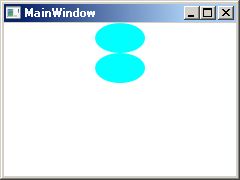 実行結果は、左図で同じ図形になります。 実行結果は、左図で同じ図形になります。
DataContextの変更は、それ以前に作成したコントロールのインスタンスにも影響しています。
これは、2通りの解釈ができます。
1つは、実行時にもバインディング元の値を参照するようになっていて、その参照にはその都度DataContextが参照される。
もう1つは、コントロールのStyleプロパティに設定したStyleのインスタンスは同じものなので、Styleが保持している値が変更されると両方変更されることになる。
Styleのコピー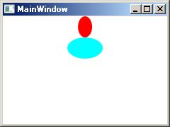
上の例は、本来異なるStyleのインスタンスをコントロールに割り当てるべきものです。
Style は XAML記述の方が、エディタの入力支援を受けて効率が良いが、XAMLからは Resources[] に、1対1でしかインスタンスが作れません。
Styleはコピーするよりも、シリアライズ(XAML記述と Visual の相互変換)を行う方が普通のようですが、バインディングの扱いの理解のためにコピーをして見ます。
以下のようなコピー関数を作りました。
肝心のTempleteは、コピーを作ることができず、2つのStyleのインスタンスは、同じのControlTempleteインスタンスを持っています。コピーできたのは、サイズや色のバインディングデータです。Style に加えた Setter のバインディングは、Binding型で、そのまま保持されていました。これを、バインディング先の値に置き換えています。
- Style CloneStyle(Style s)
- {
- Style d = new Style(s.TargetType);
- foreach (Setter v in s.Setters)
- {
- Debug.WriteLine(v.Property.Name + " " + v.Value);
- if (v.Property.Name == "Template")
- {
- d.Setters.Add(new Setter(v.Property, v.Value));
- }
- else
- {
- if (v.Value.GetType() == typeof(Binding))
- {
- MemberInfo[] mis = DataContext.GetType().FindMembers(
- MemberTypes.Property,
- BindingFlags.Public | BindingFlags.Instance,
- null, null);
- MemberInfo mi=mis.First(
- (Func<MemberInfo, bool>)((x) =>
- {
- return x.Name == ((Binding)v.Value).Path.Path;
- }));
- PropertyInfo pi = (PropertyInfo)mi;
- object o = pi.GetValue(DataContext, null);
- d.Setters.Add(new Setter(v.Property, o));
- }
- else
- {
- d.Setters.Add(new Setter(v.Property, v.Value));
- }
- }
- }
- return d;
- }
コントロールを生成する箇所をこの関数を使うように修正しました。
- // 1つ目の楕円(縦長、赤)
- DataContext = new C1();
- Control ctrl1 = new Control();
- ctrl1.Style = CloneStyle((Style)stackpanel1.Resources["ellipse_style"]);
- stackpanel1.Children.Add(ctrl1);
結果は、図のようになります。
最初の例で、2つの図形が同じになるのは、Styleのインスタンスが同じだからと言うよりは、バインディングしているデータが同じだからと言うことでした。
このことから、XAMLファイルで記述した1つのStyleを、コードでResources[]から取り出して使う方法でも、複数の外観を持たせることは可能だとわかりました。
条件は、Template が共通に使えるなら、と言うことになります。
参照
問題を整理すると、
-
XAMLを分割して記述する方法
-
記述1つから複数のインスタンスを得る方法
と、言うことになります。
「カスタムコントロールのXAMLとコード」
「Styleとプロパティ」
「Styleとバインディング」
「DataContextとインスタンス」
「XAML記述とVisualの変換」
「1つのStyle記述から複数のインスタンス」
「FrameworkElementFactory(コードでTemplateを作る)」
|
